- Cases
- Direktesport: a seriously sporty streaming service
DIREKTESPORT: A seriously sporty streaming service
Amedia wanted a solution for how Direktesport could become the local hero, in a jungle of independent brands.
6,000 matches a year
A few years ago, Amedia launched a digital, sporty alternative to the traditional media houses. The initiative was named Direktesport and has grown impressively since the start. On top of Amedia’s 80 local newspapers, the media house has built a joint digital streaming service with up to 6,000 matches and events a year.
Direktesport: the local hero
Amedia wanted a solution for how Direktesport could become the local hero, in a jungle of independent brands. Each of the 80 local editorial teams has its own logo, often unchanged for decades, and finding one that everyone could identify with and embrace as their own was no small challenge.
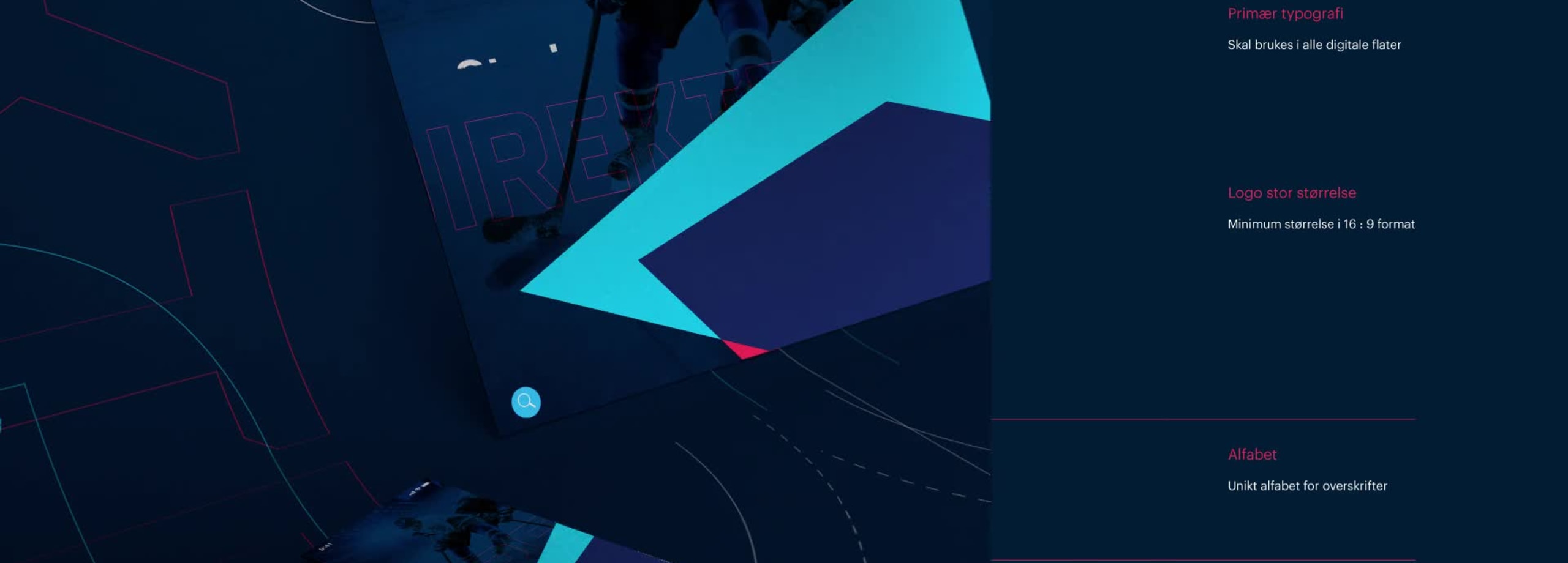
Amedia wanted a unique symbol that would be easy to recognize on digital surfaces and in print. It was important that the symbol felt popular and said this was about sport, but also that it could live dynamically in a digital world and tell small stories on its own.
A playful logo can tell many stories
Today, brands constantly have to adapt to a fast-changing environment, so Direktesport wanted a playful, energetic and sporty logo. The internet and social media have given brands the chance to behave like living organisms. Each editorial team has its own DNA, with unique knowledge of local sports events.

A simple identity
The shape of the symbols varies, but they still read as one simple identity with consistent forms and a clear color composition. It was important to Direktesport that the profile created Norwegian associations. Maverix therefore settled on an active red and a light blue as a starting point. The intersection of the two created the exciting blended color dark blue, which symbolized the editorial teams’ area of focus.
Watch the full case film here:
Fira, not FIFA
Maverix based the wordmark on a simple, industrial sans serif font with a unique charm. Direktesport is a long name made up of two words. We wanted to split the word visually and create an exciting dynamic in the wordmark itself, so we weighted “direkte” and “sport” differently. The typeface is Fira, a geometric sans serif from Amedia’s own identity. It is flexible, with a good range of widths. The font works very well on mobile and is easy to use for large amounts of numbers, as found in sports tables.
Our cases
We work with some of the Nordic region’s best-known brands
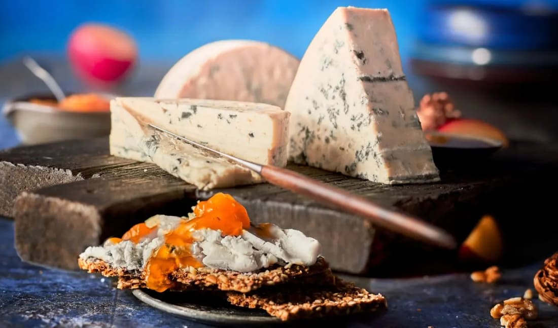
TINE: Finally, a slightly softer novelty

Taco all week: how SANTA MARIA became the biggest in Norway

Everything in order with CLAS OHLSON
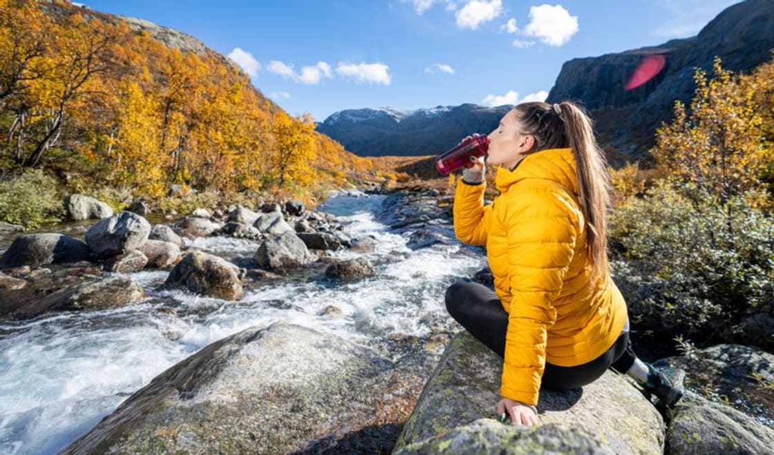
Gold for Visit Norway and Maverix: An ever larger piece of Norway
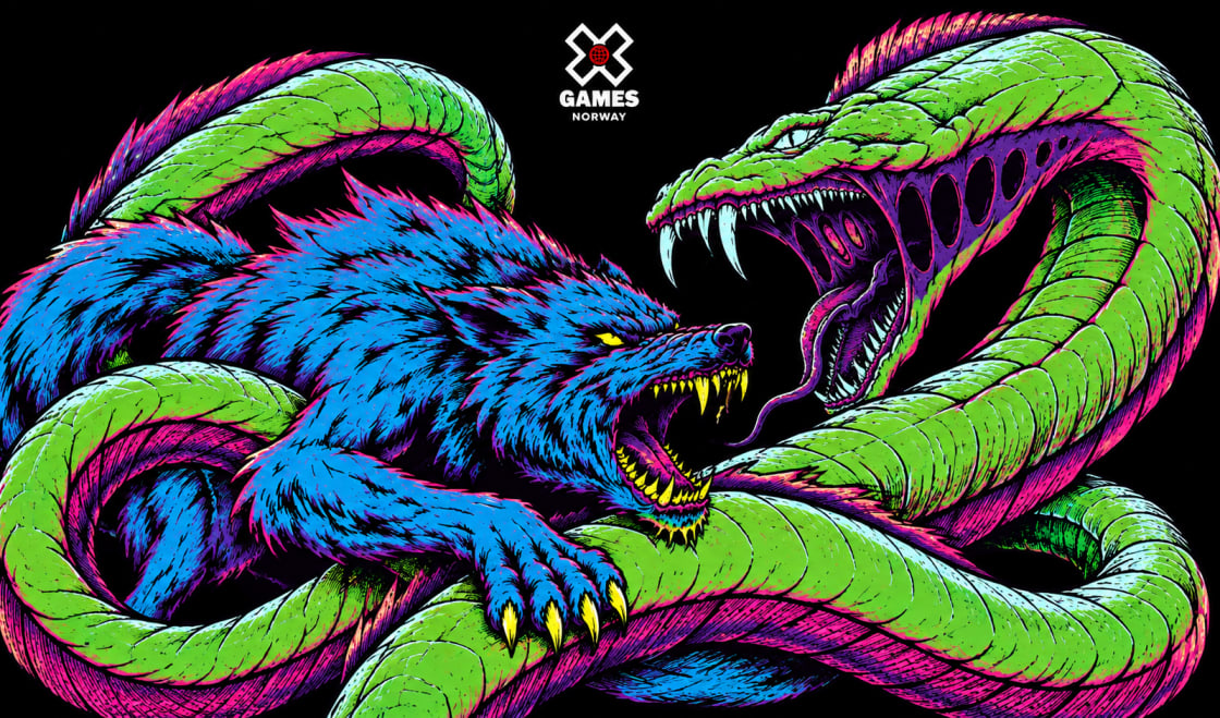
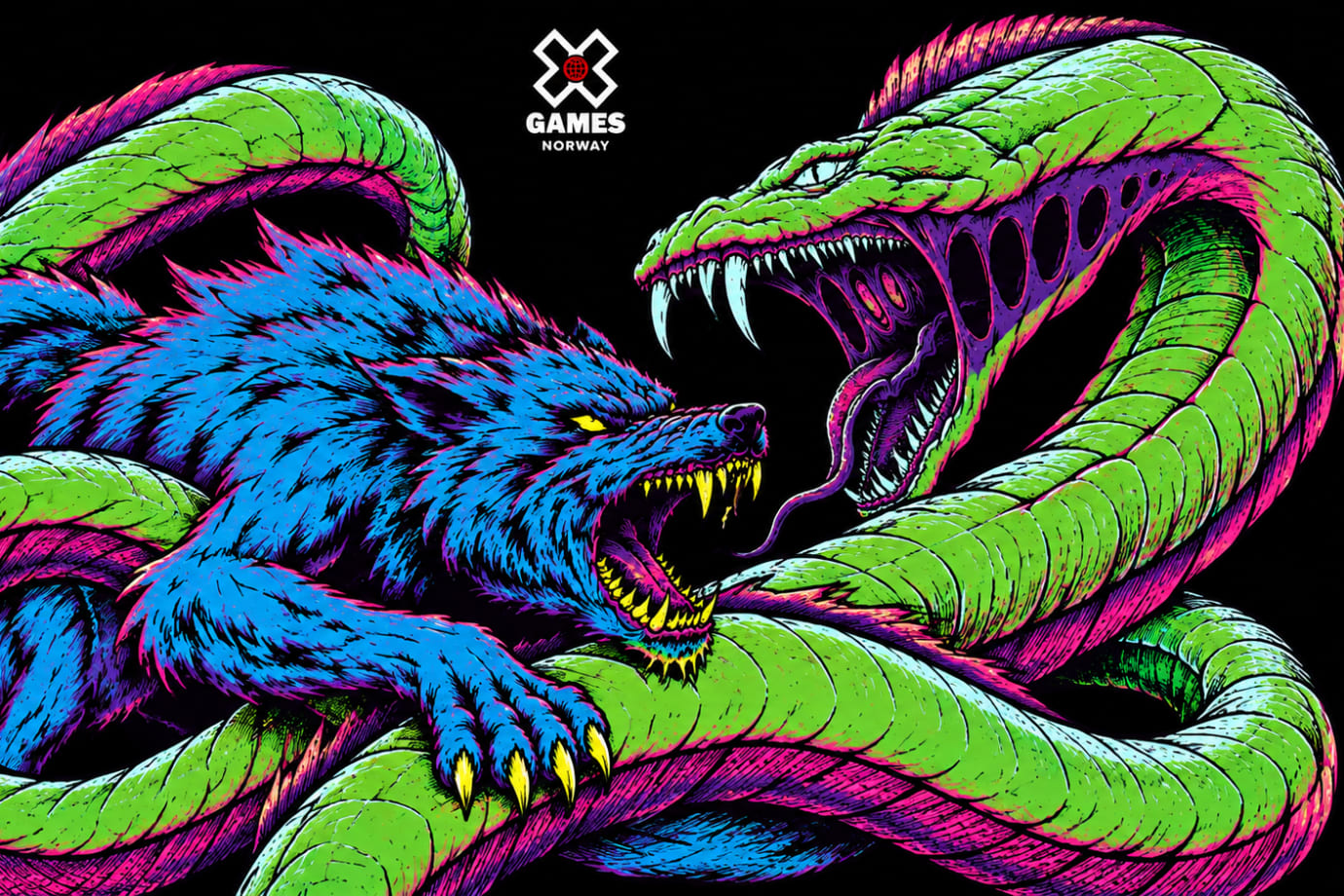
Fenris the wolf fronts X Games: design for ESPN

XXL: Black Week – Bright Moments

1001 Strawberry stories from all over the Nordics
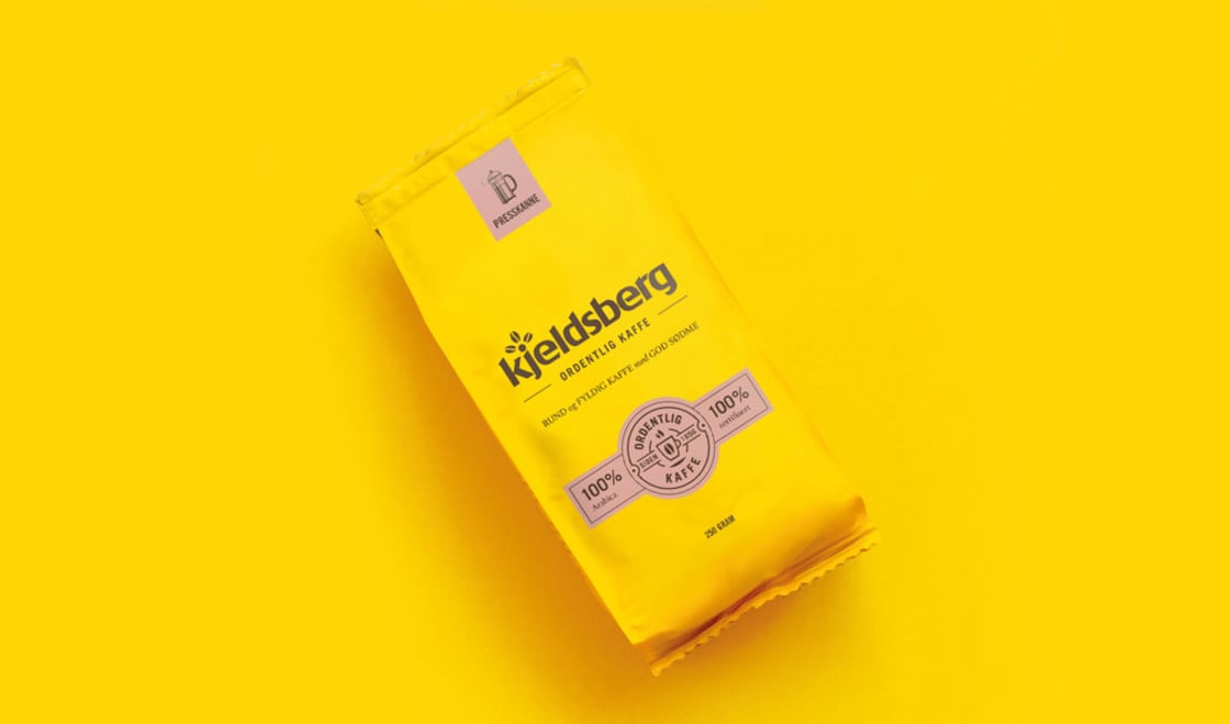
KJELDSBERG KAFFE - design relaunch
- See more cases
Latest from Maverix
We lead the way in development


Questions and answers
What is Direktesport?
Direktesport is Amedia’s streaming service for local sport, built on top of the media house’s 80 local newspapers. It broadcasts up to 6,000 matches and events a year.
What was Maverix’s assignment?
Amedia wanted Direktesport to become the local hero and stand out among many independent brands. Maverix created the concept and the campaign to make that happen.
What else has Maverix made in sport?
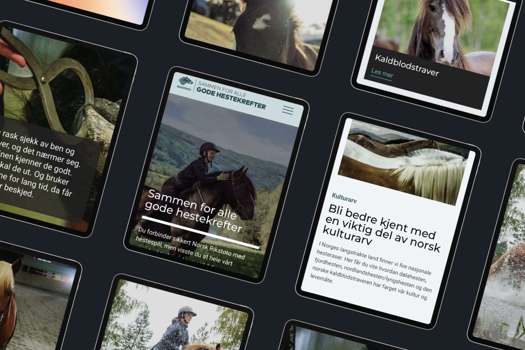
Maverix has, among other things, made design for X Games and content for Norsk Rikstoto, as well as TV series such as Gutta på tur.
Get in touch

